Case study · 2025
This started as a JavaScript course project. I turned it into a UX research problem. Children ages 3 to 8 have completely different cognitive abilities, attention spans, and motor control. Building one game that works across that range meant testing with real kids and redesigning everything I thought I already knew about interaction design.
MY ROLE
Designer and developer, end-to-end
YEAR
2025
DURATION
4 weeks
TOOLS
JavaScript, HTML5, CSS3, Figma
THE CHALLENGE
HOW MIGHT WE
How might we make a game accessible to a 3-year-old without boring an 8-year-old?
HOW MIGHT WE
How might we design touch interactions for users with limited fine motor control?
HOW MIGHT WE
How might we keep children engaged when frustration leads directly to disengagement?
RESEARCH
I ran informal testing sessions with children across the target age range, watching how they actually interacted with the game rather than asking them to describe their experience. Children this age can’t articulate what isn’t working, so observation was the only reliable method.
Four things came up consistently: younger children couldn’t handle time pressure, visual recognition worked better with familiar animals than abstract shapes, touch accuracy varied significantly by age, and the emotional response to failure was fast and total. A frustrated four-year-old does not try again.
“The timer is too fast! I can’t remember that quick!”
– Testing participant, age 4
PROCESS
01
Discover
Observation sessions with children ages 3 to 8, noting where interaction broke down and where engagement held
02
Define
Core constraints identified: fine motor limitations, time pressure sensitivity, need for visual familiarity, and the frustration threshold problem
03
Develop
Three difficulty levels designed around age-based ability; visual system built for contrast and recognition; touch targets sized for small, inaccurate hands
04
Deliver
Built, tested across difficulty levels, confirmed that 3-year-olds could complete easy and 8-year-olds found hard appropriately challenging
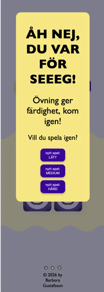
SOLUTION
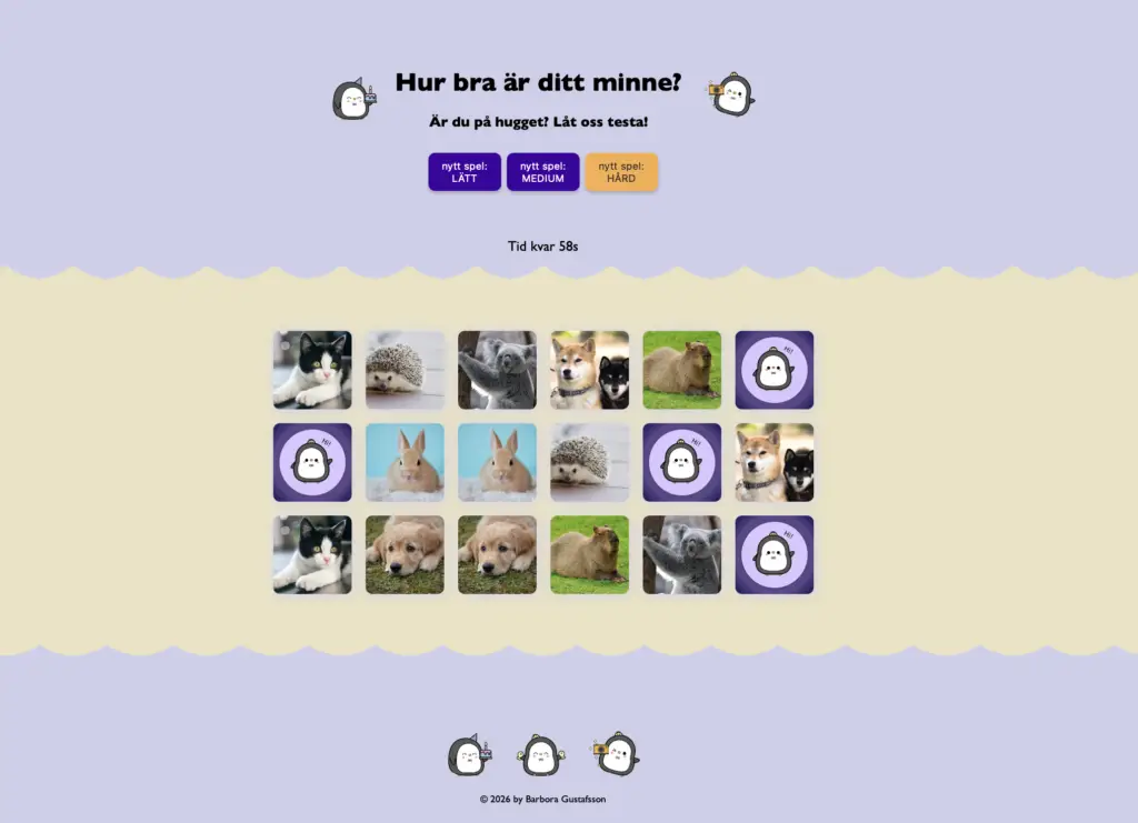
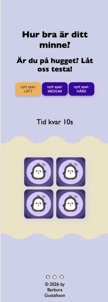
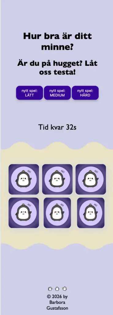
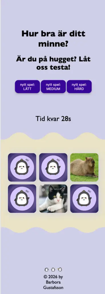
A mobile-first memory game with three difficulty levels mapped to age-based ability. Easy mode has fewer cards and more time. Hard mode is fast-paced for older children. The visual system uses purple and yellow for strong contrast against developing vision, with animal photography children could immediately recognise. Cards flip with a clear animation so the interaction always confirms itself visually.
Every sizing decision, from font size to card spacing to touch targets, was driven by the specific constraints of young children’s motor skills rather than standard web conventions.
OUTCOMES
3-year-olds
completed easy mode successfully in testing
8-year-olds
found hard mode appropriately challenging
The game covers the full target age range. Each difficulty level reached its intended users. The most unexpected finding was that younger children sometimes stopped playing the game to explore the visual design instead, which caused them to run out of time. That’s a problem, but it also means the visuals were doing their job.
WHAT TESTING TAUGHT ME
REFLECTION
User testing with children is a different discipline. They won’t tell you the timer is too fast in a feedback form, they’ll just stop playing. Every assumption I brought from standard web design had to be tested from scratch. Touch targets that seemed generous weren’t. Time limits that seemed fair weren’t. The gap between designing for adults and designing for children is much larger than the gap between designing for two different adult groups.
The most valuable moment in this project wasn’t a design decision. It was watching a 4-year-old forget to play the game because she was too interested in looking at the animals. It reframed what accessibility means for this audience. It isn’t just about contrast ratios and font sizes. It’s about understanding what attention actually looks like in a 4-year-old and designing around that reality.
We use cookies to improve your experience on our site. By using our site, you consent to cookies.
Manage your cookie preferences below:
Essential cookies enable basic functions and are necessary for the proper function of the website.
These cookies are needed for adding comments on this website.
Statistics cookies collect information anonymously. This information helps us understand how visitors use our website.
Google Analytics is a powerful tool that tracks and analyzes website traffic for informed marketing decisions.
Service URL: policies.google.com (opens in a new window)
You can find more information in our Privacy Policy.