Case study · 2026
Piggy Bank App:
Children ages 4-7 handling money in cash-free world
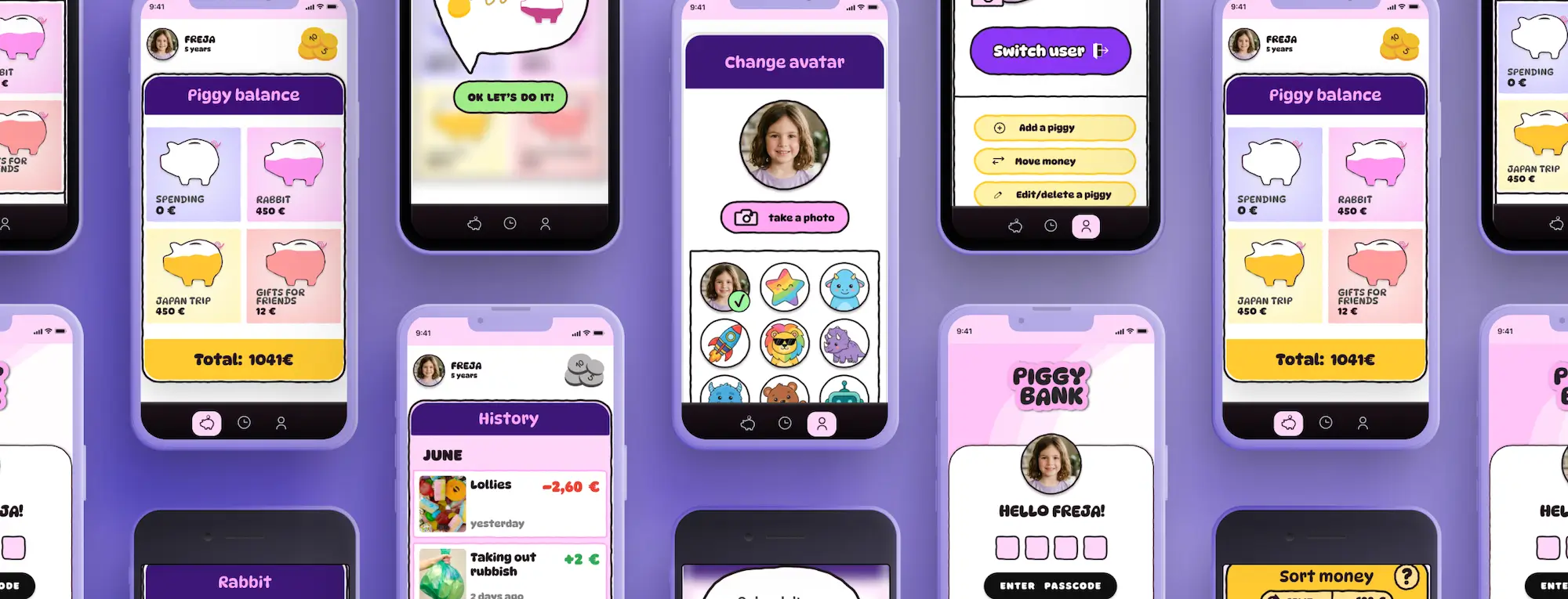
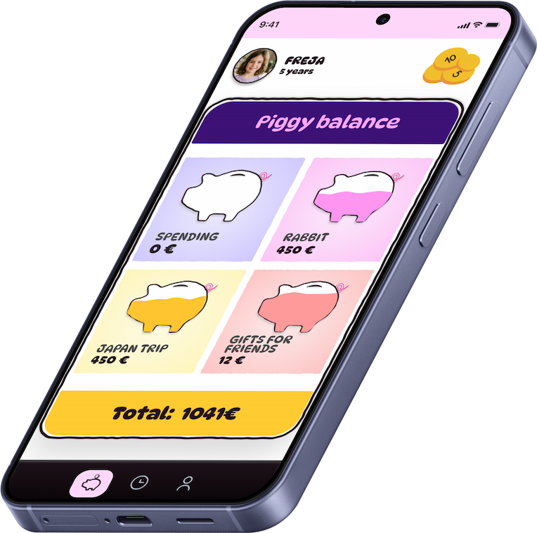
Interface for child facing part of a money saving app
MY ROLE
UX/UI designer, end-to-end
YEAR
2026
DURATION
4 weeks
TOOLS
Figma, Illustrator, Claude (brainstorming), Gemini (image generation)
THE CHALLENGE
Small children want to be able to handle money but parents often don't carry coins on them.
HOW MIGHT WE
Ensure children who can’t read yet still fully engage with the app?
HOW MIGHT WE
Create a tool that makes it easy for parents and small children to track pocket money?
HOW MIGHT WE
Make the app simple enough so that small children can enjoy it yet keep functionality?
RESEARCH
What's the issue?
Younger children wanting to handle their pocket money in a cashless society is a problem many parents and caregivers are already trying to solve.
There are apps from banks and private developers, each a little different but doing roughly the same thing. Bomad for example is a piggy bank app designed for older kids, now moving towards connecting with real bank accounts. But there is no go-to solution that parents trust and kids enjoy.
Competitor analysis showed that bank apps were hard to test without accounts and the ones from private developers were often buggy or unfinished. None of them focused specifically on the youngest age group.
“Yes, children definitely want to be able to track their money, they even work with it in the kindergarten. But I think Lova (name changed) is too small for a bank account so I just hold onto the money and write it down in my Notes app on my phone. It’s not very convenient but kind of works.”
– Parent of two, Uppsala
Secondary research (comment sections under various piggy bank apps in the App Store, Reddit threads and Facebook discussions) and informal conversations with 5 parents at a local playground revealed what users are looking for and what’s missing on the market.
Main pain points
- Parents struggle to keep track of how much pocket money their child has earned or spent.
- Children don’t track their money either but they’re very good at asking for more.
- Young children want their own say in what happens with their money.
PROCESS
Design challenges
a) Clear and simple messaging:
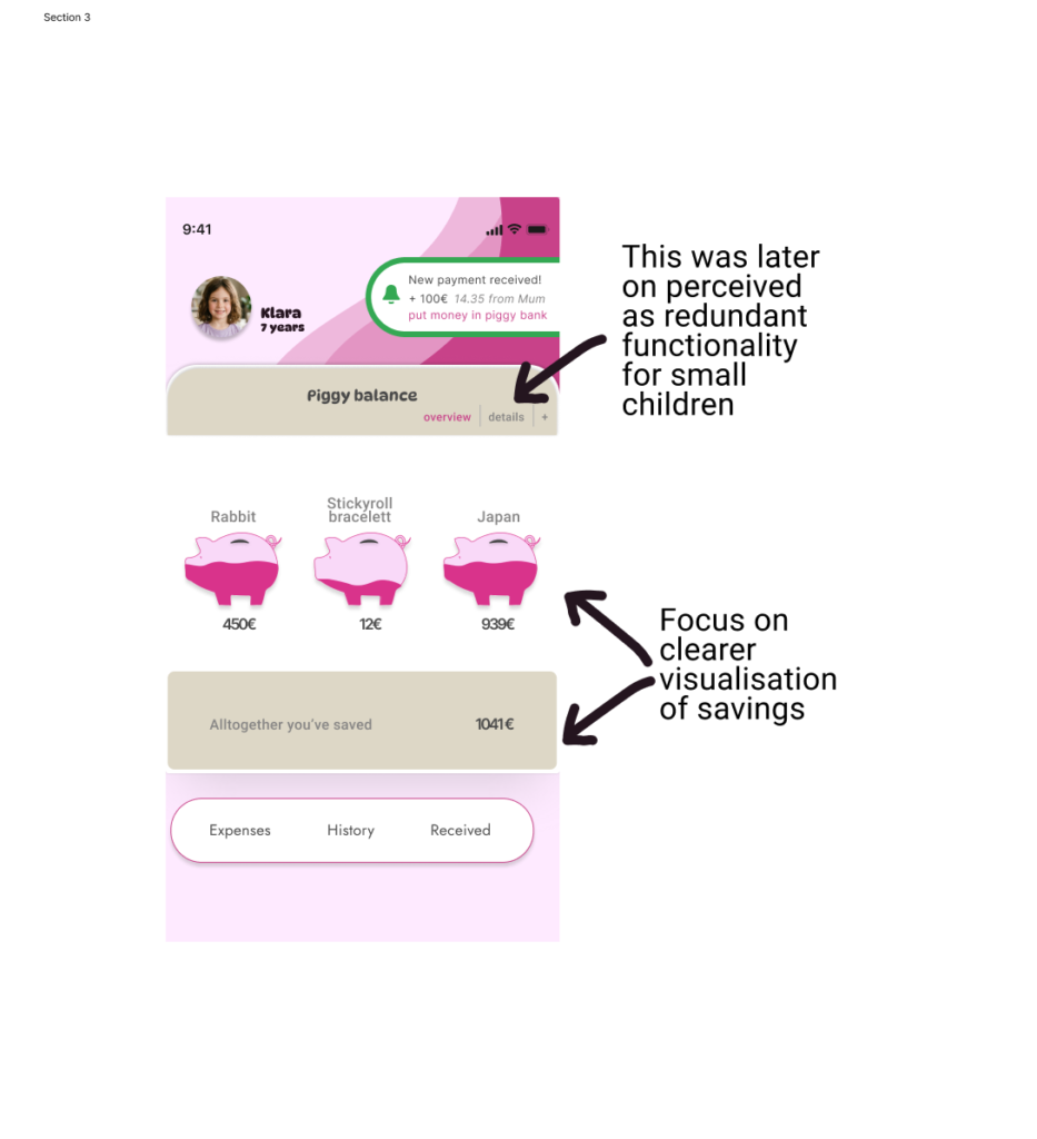
Making saving feel visual
- Avoiding visual clutter:
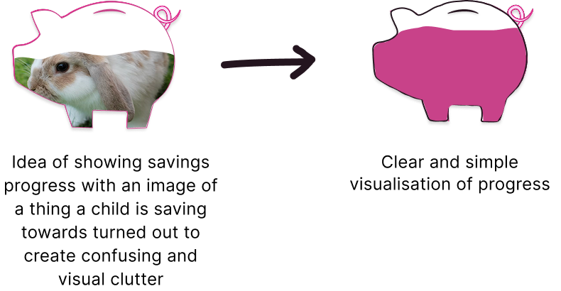
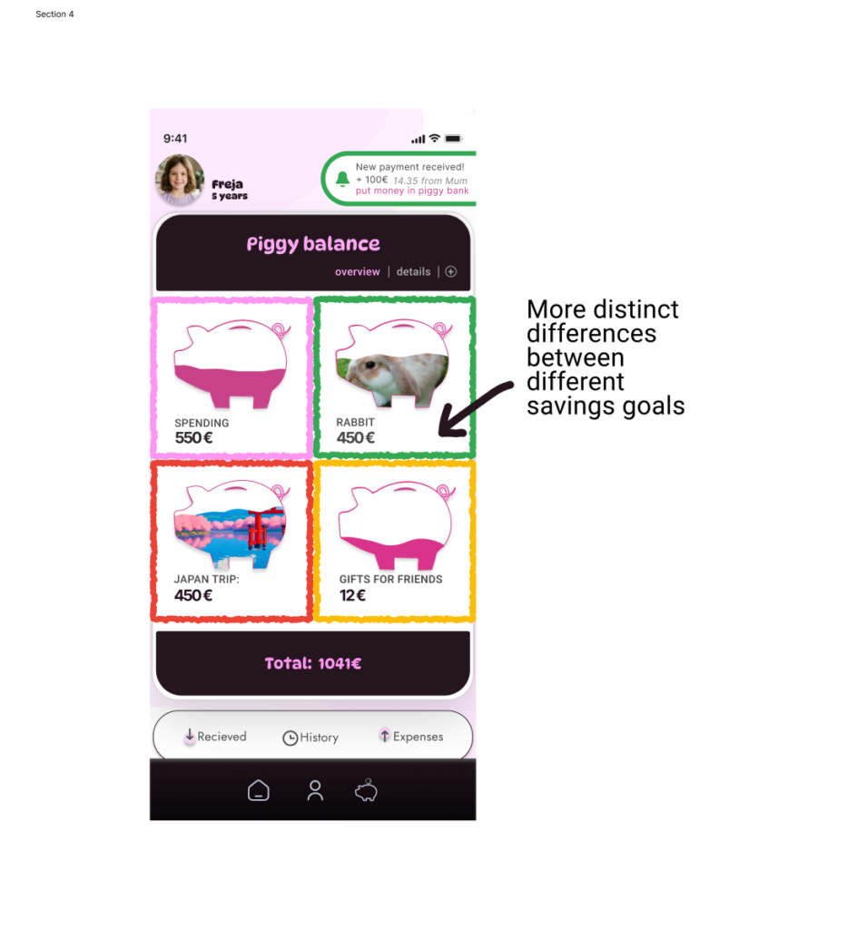
The first idea was to fill the piggy bank with an image of what the child is saving for. For example a rabbit photo inside a pig shape. This turned out to be visual clutter with low contrast and gave unclear visual cues. Instead each pig fills up with its own color
- Large buttons or clickable objects to ensure children don’t miss
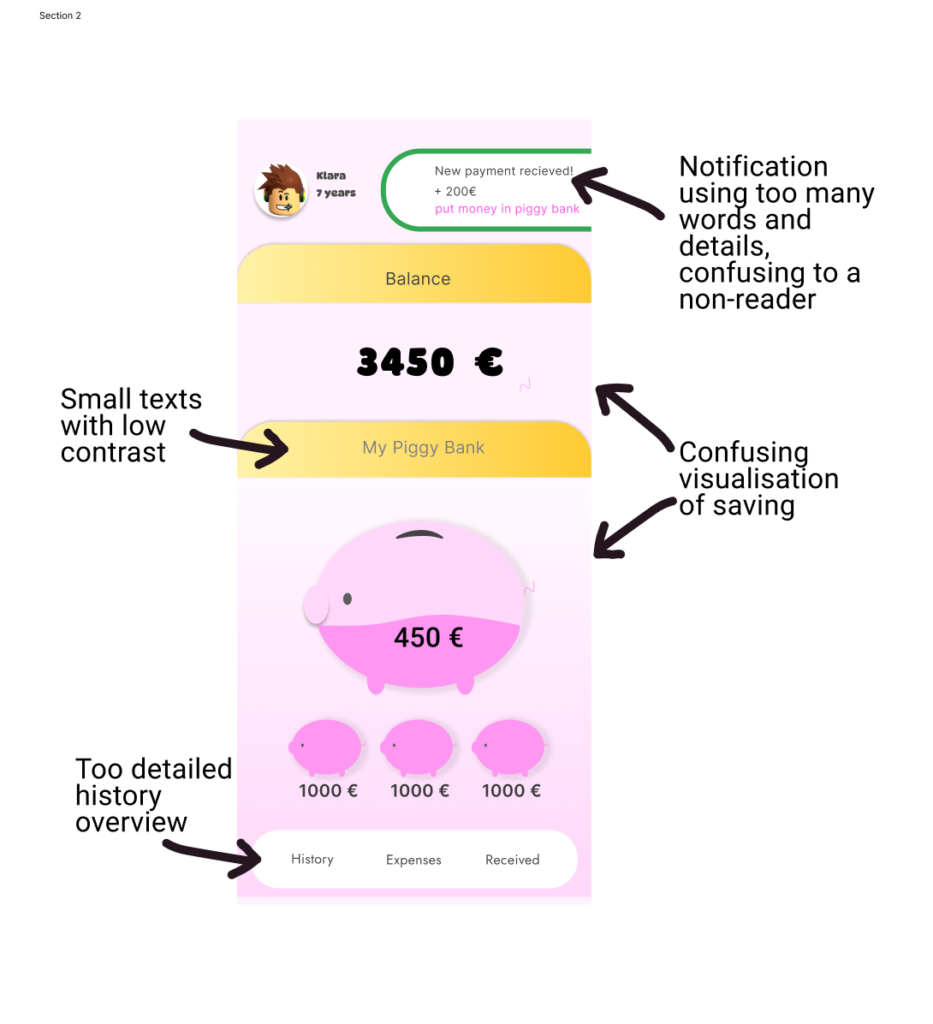
- Simple words are used across the app instead of longer phrases: “Total” not “Altogether you have saved”
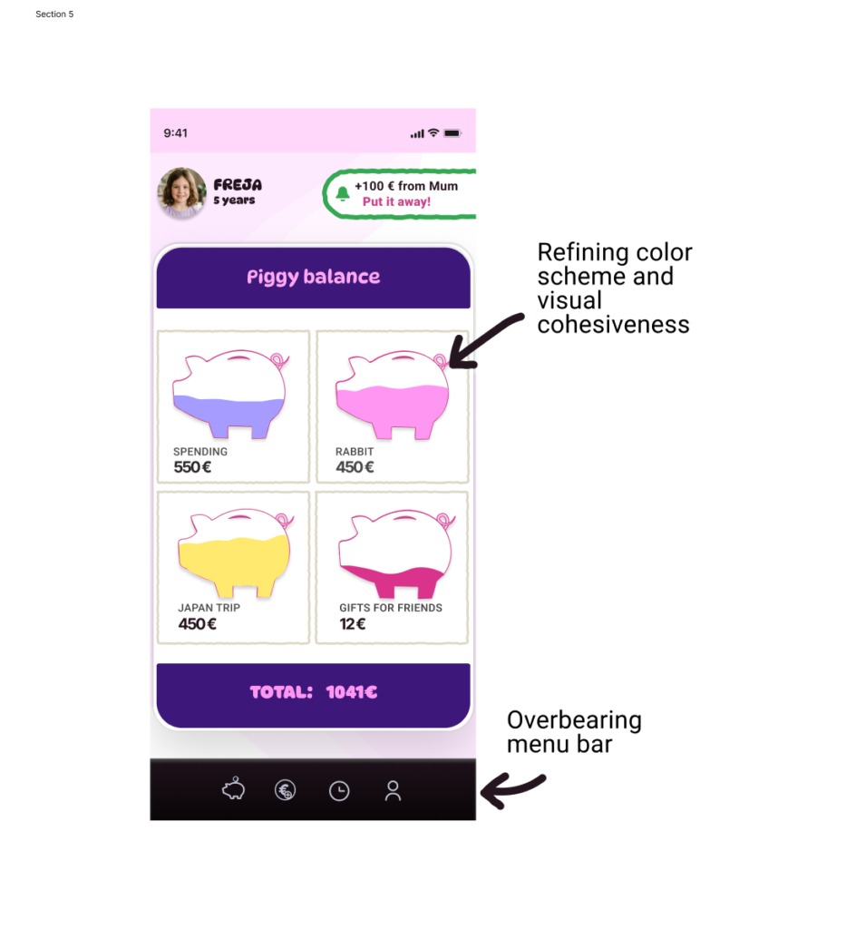
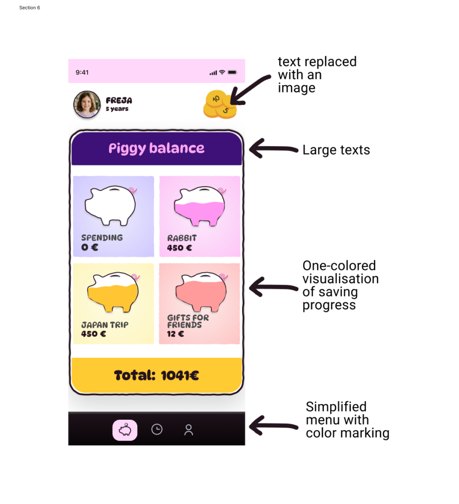
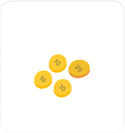
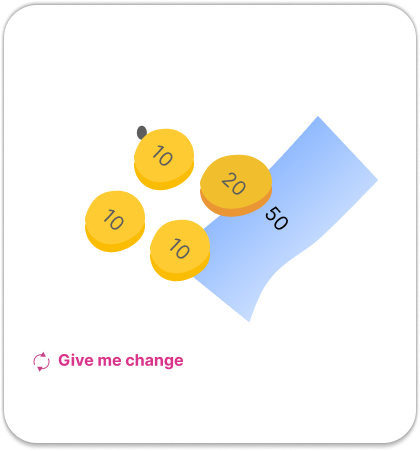
5 home screen iterations:


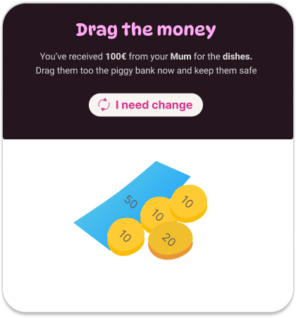
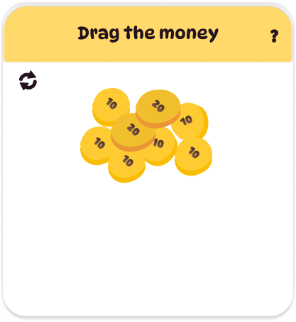
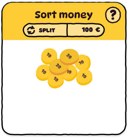
5 money sorting iterations:


b) Autonomy and accessibility:
Children aged 4-7 can't read or can't read well
An important feature of the app is that all text and numbers get read aloud when tapped. Buttons on the other hand use icons and distinct colors so a child can use the app fully without having to be able to read yet. As a bonus, the talking app gives parents awareness of what the child is doing without having to watch over their shoulder.
- Large text in a legible font for developing readers
- Short words instead of long phrases
- Repetition to help children memorize meaning
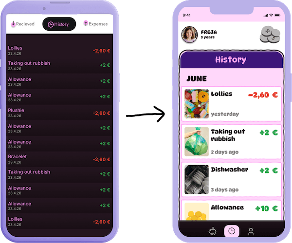
- Color guidance: green for money in, red for money out
- High contrast so every element is easy to spot
- On-tap reader
- Limited functionality to keep focus on the task
c) Keeping the app fun while functionality is limited on purpose
The child can take photos and choose their own avatar. They can count and move coins inside a piggy bank. They can drag and drop (or tap and tap) to sort money into their piggy banks. History shows big colorful numbers and pictures of what they earned or spent money on. Green for money in, red for money out. Limited options, but every one of them feels good to use.
SOLUTION
A mobile app with audio guidance and two different interfaces
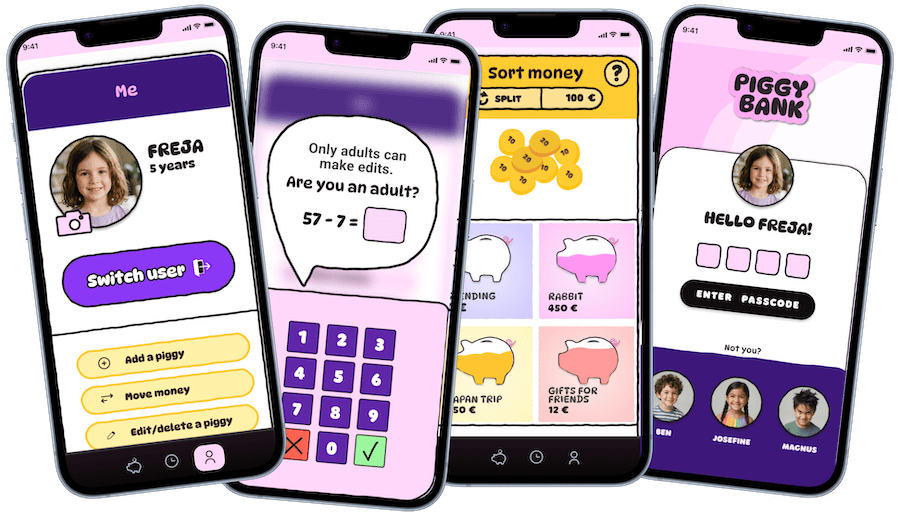
A dual mobile app with a simple fun interface for children and a sister app on the caretaker’s phone where all administrative tasks take place.
Some adult settings can be accessed inside the child’s app so adjustments can be made without switching devices. These are hidden behind a math equation only adults can answer.
The child’s interface has limited functionality on purpose. Fewer options means no decision fatigue. The child stays focused on what the app is actually for: learning to save money, read and count. Every text and number has voice support so children who can’t read yet can use the app on their own.
USER TESTING
Kids couldn't use the Figma prototype but validated the concept when shown a demo
I tested the high-fidelity Figma prototype with three children (ages 3, 5 and 8) but the testing didn’t go as expected. Since the prototype was a bit laggy and not fully functional, the children lost interest quickly. For this age group, a working MVP would likely produce better test results than a Figma prototype.
I also ran a guided demonstration, walking the children through the intended user flow. Children were excited about the design, and all three expressed interest in having the app for real so they could track their own savings and explore on their own.
Prototype walkthrough
The child’s interface walks through four main paths:
- logging in
- failed login
- viewing savings
- receiving money and sorting it into piggy banks
- and exploring what’s inside each piggy bank
- history
- changing user avatar
- logging out
Every screen uses large tap targets and simple icons so the app works without reading. In the full product, all text and numbers would be accompanied by audio on tap.
REFLECTION
Less is more
The biggest takeaway from this project was getting comfortable removing features that were already designed and added. It’s tempting to see a good app as one with many options and room for personalisation. But user data and the actual capabilities of 4-7 year olds ask for simplicity. Stripping features and using that space for larger fonts, bigger tap targets and audio feedback made the app better and more accessible.
To create a full app design, the adult interface needs to be thought out and designed as well. That process would likely reveal some missing pieces in the child’s interface and help improve it too.